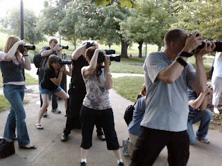
Attended a workshop last night put on by Tammy and Tom Byran, well really it was an engagement shoot where they let the camera club follow them around and see how they did it. After that we went out to an Irish pub and talked. I had a great time. It was nice to see what others were doing and how they went about things. No matter how good you are at something, it's always important to keep fresh and see what others were doing. You can always learn. I know the shot above isn't anything to write home about (I took it with my Blackberry Storm) but it shows the people that were there. Glad I could make it!
So yesterday we talked about the basic section of the develop module of Lightroom. We covered what everything was and how to use it(with exception to the gradient tool and adjustment brush). Today we're going to finish the develop module.
The next drop down we come to after the basic is the tone curve adjustment drop down. Anyone that is familiar with Camera raw should feel right at home here. There is a tone map that can be clicked and drug up or down to adjust for contrast. I tend to go to the drop down that says Linear circled in red here:

In that drop down you have three options: linear, medium contrast, and strong contrast. I generally choose medium contrast for Jpegs and strong contrast for Raw files. There are sliders underneath that can be adjusted for fine tuning as well. I generally don't go that route though. There is one more tool inside of tone curve that you may or may not even know is there. It's called the TAT. TAT stands for target adjustment tool. It is circled in red here:
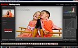
The TAT works like any of the other tools. You click it to "pick it up". Once you do, move it over the spot in the image that you want to adjust, then click and hold your left mouse button. Now drag the TAT up or down on the image and you will see the tone curve adjust and the image change. Once you have gotten the desired result, just return the TAT to it's original place and you're done. Pretty easy huh? That's it. That's all there is to the Tone Curve drop down.
Moving on to the HSL/Color/Greyscale drop down. When you open this drop down you see a number of things(depending on which option is selected. If you have the HSL selected you will see Hue, Saturation, Luminance, and ALL with color sliders below them. These are all just as they seem. You slide them to the left or to the right to increase or decrease that particular color in the image. Kind of blunt in my opinion. Again there is a TAT next to the box that can be used anywhere in the image to adjust these things. This is the best way to adjust the colors because whether you know it or not the color you want to increase usually has other colors in it. So when you use the TAT you can adjust all of those colors instead of just one. It saves a whole lot of time and effort. Click on the color option and again you have some fine tuning options for the colors. Greyscale is exactly as it sounds. It converts your image to black and white and gives you the color channels to adjust so that you can increase contrast.
The Split Toning drop down is next. I don't use it. I haven't had a need to do a split tone, and until I get a client that wants that particular service, or I get the sudden urge to make my photos look like they are from the 70's, I probably won't use it. Since I don't use it, I don't want to send you in the wrong direction with it, so I'm going to say go read Scott Kelby's book if you want to know how to use it.
Detail drop down is very important. This is where your sharpening lives, as well as your noise reduction. I'm not going to spend a whole lot of time here because quite honestly this is self explanatory. You drag the slider to the right to increase and the left to decrease. Now you're a pro in the detail department.
Vignettes has a new feature that is awesome! The first set of sliders we see in the drop down is the Lens correction slider. This slider does the normal vignette adjustment to the image. It will add darker edges by sliding it to the left, lighter edges by sliding it to the right. Simple. The next section down though is really where the power of this control is. The "Post-Crop" is just as it implies, post crop. You can make a vignette adjustment here and no matter what size you crop the image to, the vignette stays with it. I don't know about you, but I think this is great! I don't like having to add a vignette twice(which I used to have to do in PS if I forgot to crop before I added my vignette). This makes things easy.
So that's it for the drop downs. On to the two tools that I left out above. Gradient, and adjustment brush. Lets start with the gradient tool.
You select the gradient tool like you do the other tool in Lightroom(by clicking it and "picking it up"). Once you do, you will see some controls below it appear. The first thing you need to do is select what you're going to adjust. Click where it says Exposure. I circled it in red here:
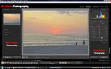
I also circled what looks like two small squares. These are the "on/off" for the rest of the controls. Make sure that the small right box is selected. This allows you to adjust all of the sliders for the selected area. Now that you have what you want selected you go to the image and start at the top(or wherever you want your gradient to start) and while holding the shift key, drag down. This tool is used mostly for adjusting sky's like in my example image. I usually select exposure as the adjustment that I'm going to make, and I usually decrease the exposure. Now look at this image:
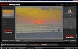
Notice the difference between this one and the first one? You can see that I increased the saturation a little as well as decreased the exposure. If you don't like what it looks like make sure that the dot in the middle of the screen has the smaller black dot inside of it(which selects that adjustment) and hit delete. This will delete the selection.
The adjustment brush works just the same. Select the adjustment brush and you will see the same drop down and list of adjustments below it. Again make sure that the small box is selected on the right so that you can adjust all of the sliders for the selection. In the image below you will see that I increased the exposure on the sand to lighten it up a little. This is apparent by the small "pin" on the left side of the screen in the sand. You will see that it is the pin selected because it has the small black dot in the center of it. Again if you want to delete the adjustment just make sure that the pin you have selected is the one that you want to delete and hit the delete key.
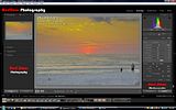
Now here's something nice about using the adjustment brush. You can view what you have "painted" with it by moving your cursor over the selected pin. When you do, the area that you have "painted" will glow red like this:
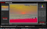
A couple of things to note about using this tool; first the brush size can be adjusted by pressing the left and right bracket keys ([ ]). Also if you look below the size, feather, and flow sliders, you will see a box marked auto mask. This is the best part about the adjustment brush. When it is checked, the brush will only "paint" an area with similar color to the area that you first clicked on. So in my example image, I just clicked in the sand first and then I didn't have to worry too much about getting too close to the water because it was a different color. This function works really well. Like with the gradient tool, once you have made a selection, you can adjust multiple things inside of that selection by sliding the sliders. That's all there is to it folks. It's pretty easy once you know what everything does.
Well that's it. Those are the major components of the Develop Module. I hope this has helped you have a better understanding of how to use the develop module. I'll be back tomorrow with a guide to the Slide show section. Until then, have a good one. Jason



No comments:
Post a Comment